I am super excited to share my July layouts with you. This month we are featuring the Trendsetter collection by Fancy Pants .
Now I love Fancy Pants, and I love this collection... but for a mom of boys it does have a fair amount of pink in it... but hey I was up for a challenge ... and who says you cannot use pink for boys anyway!!
I remembered I had these pictures from our 2011 Disney trip in my stash, and thought they would be great for this collection. I really like the pink on this layout. I started out with a simple layout, and lots of 'white' space as I knew I wanted to do a larger title.
I layered up some banners under my photos and 'highlighted' one photo with a frame.
Some stitching for an easy bit of pop.
And a super fun title that really says 'Winnie the Pooh" without being really theme-y. I love how it turned out, I was sort of sitting on these pictures waiting for just the right time to scrap theme. I am not really a fan of themed papers so this worked out just perfectly for me.
Next up is this fun bubble bath layout. What could be better after a snowball fight and snow fort building? Another layout with lots of pink, this time the darker pink is a bit more of a prominent colour. I think it looks nice with his rose-y cheeks!
I took my lead from the theme of the photo and created this bubble base for this layout, adding pops of patterned papers behind for oomph.
I created a few die cuts that say 'boy' and layered up some papers, die cuts and embellishments.
It's a little hard to tell in this photo but I added some glitter pen to the die cut 'bubbles' to help them shine.
My title is another 'compilation' title with shapes and die cut letters, on a base... this time I also added some printed lettering, too!
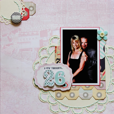
My last layout features my husband and I, and is a tribute to our most recent anniversary. I first had to teach myself how to 'cut' us out of the original photograph, in Photoshop, and create a new background for us. The picture was taken during our recent cruise and the background had royal blue in it... aack so not me and so not for this collection! Anyway, I did an okay job, you can only tell if you look really close. I decided to make this a little more elegant a black background would be good.
There were die cut numbers in this collection, so I popped them up to create my title.
These tags are cut from one of the patterned papers and layered with a die cut doily.
I really like using part of die cut frames as tabs under my photos.
These strips of tags were also fussy cut from a patterned paper.
It took a little while (a couple of sitcoms) but I love the way the stitching looks on the doilies. It was not preplanned, rather added at the end, so I had to be careful with my layout but it really gives it some pop!
I had some goodies left over so I creating this card. It is simple and pretty all at the same time.
The moral of the story is .... the next time, you look at a paper collection and see something you are unsure of do not discount it right away... you probably have some pictures in your stash that are just perfect for it.
Thank you for visiting today!
Laura
xoxo


.jpg)


No comments:
Post a Comment