Happy Canada Day to all of our Canadian followers! It is great to be able to enjoy a long weekend, I hope you get to squeeze in some scrappy time. Here is our usual Friday sketch for you to play with.
Don't forget if you create a layout based on this sketch, you can have it published here on this blog by emailing me a picture of your creation by Thursday July 7th at 6pm here.
And now for my monthly reveals. This month I was fortunate enough to get to play with Lime Twist by MME. Actually, I got some of the 'Happy Go Lucky' collection and some of the "Out of the Blue" collection. And both are super fun to play with, the colours are fun a vibrant and as you can see from my layouts, both collections are very versatile. Here is a little sneak peek at the line.
(you can click on either picture to see the full lines on the MME website)
I knew when I saw this line that I wanted to use it for this photo of my son, Timmy with 'Goofy'. I thought that the purples were so pretty but that there was enough teal and blue in the papers that it wouldn't be over the top girly. And some times a Mom of boys needs to play with other colours, wink wink!
I added some of the bakers twine that coordinates with this collection to my 'lollipop' flowers. I think they are a super fun addition to this layout.
The title strip that came with this collection said 'this is a perfect day' which would have been perfectly fine, but I knew I wanted to use the word 'Goofy" in my title, so I altered the title strip by adding a matted banner and some small foam Thickers.
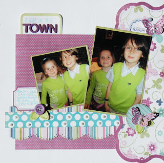
This is the second layout that I created. The two sweeties in the photos are the daughter, Zoe, and pet, Stella, of ScrapMuch? owner, Elaine. I think the pictures are perfect for this layout. I love the acrylic overlay on the larger photo.
These flowers were fun to create and are a variation the lollipop flowers. Who knows maybe a tutorial is on the way!
This layout features photos of Timmy and Zoe taken recently when a bunch of us got together for a nice dinner and a performance of The Lion King in Toronto. Nope, I know it looks like it but we did not coordinate their outfits to match each other or this paper line! lol
Some tiny little leaves turn a button into a flower. And glitter is always a good thing, I used Stickles to add the sparkle to these leaves.
A punched butterfly, more glittery leaves and a bit of doodling, just for fun.
And now for the more masculine line....
I have been sitting on this photo for a while so I was thrilled to see some train paper with this line, I like that it is not over the top theme-y.
I added pop dots and Glassy Accents to these stars stickers to give them more presence on the layout.
The ticket border strip was created with a die and some stamps.
Again the title element that came with the line wasn't quite what I wanted so I added another layer to it and then adhered a title using the mini alpha stickers that coordinate with this collection. I love doing this, it makes it more personal and it's easy to do.
More photos I have been sitting on for a while, they were taken when my now 19 year old turned 16, the photos were not what I wanted, they were taken by someone else besides me, which is unusual and I don't mind that I am in them, which is also unusual! But there was too much background 'chaos' as is typical with birthday parties. Also, there weren't enough shots of the birthday boy himself. But they did capture the side story of my little guy jumping on my 16 year old and blowing out his candles 'for him'. So I sort of went with that in my layout. This is what the journaling reads....
"I cannot believe it has been 16 years since you were born. You are turning into an amazing young man. I love the kind of big brother you are, completely playing along when Timmy 'tackled' you and blew out your candles! Continue to shine and share your true self with those around you."
Buttons and layered stickers create a nice little embellie cluster.
The 'sweet' sticker came with this collection and I hand cut the '16' out of the number patterned paper. An easy peasy title.
I loved the hot air balloons in this collection and I also really wanted to scrap this photo of Timmy, for no other reason than that I love it. This layout is fairly simple so that the images on the background paper can still be seen. And go figure, this time I left the title intact, but I did add some dew drops to it.
I layered the little star stickers onto buttons and topped them off with a layer of Glossy Accents to create an epoxy like embellishment.
I drew and hand cut the clouds, then ran them through my Cuttlebug to emboss them and added some seafoam coloured chalk ink to enhance them a bit. I thought it would be fun to add a couple of more clouds to give this page another layer of dimension.
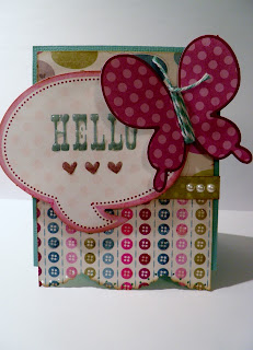
Next I made couple of cards, one masculine and one feminine.
I love the look of using the acrylic overlay on the solid card base and then adding the die cut piece.
This die cut phrase and butterfly were perfect for this card.
Glassy Accents makes the phrase shine.
Thank you for sticking with this post til the end, i know it was a long one!
Laura
xoxo


I love that saying "I love to see you Smile"! is that a stamp???? or is it a die?
ReplyDeletegreat layouts as usual Laura!
Brianne that is one entire die cut piece that you can buy, from that collection.
ReplyDeleteoh I love it! Do you have it on the online store?
ReplyDeleteit sure is, you can find it here https://www.shopscrapmuch.ca/catalog/index.php?main_page=index&cPath=25_162_166_186&zenid=9002488b8e2f0b83fcb7fc675f82e894
ReplyDeleteBeautiful work and gorgeous photos of your stunning layouts!
ReplyDelete